The Interface
The layout of the Data Entry Designer is as follows:
1. Data Entry Element Buttons
The following buttons show at element-level.
| Button | Description |
|---|---|

|
Click to enable/disable |

|
Click to add a new container to the end of the data entry element or to the end of the current tab. |

|
Click to publish the data entry element for use at runtime (on your test environment). Whenever you update an element in Designer, you must publish it for agents to see the changes you’ve made. You don’t actually need to publish each element that a desktop uses individually. When you publish a desktop, this automatically publishes all scripts and data entry elements that the desktop uses. As such, you may find it easiest to always just publish from the desktop. |
2. Tab Menu
Where you have enabled tabbing, click  and then Properties to add or delete tabs.
Use the Select tab dropdown to move between tabs.
3. Controls
To add a control to your data entry element, drag it from the Controls list to a container.
For a full description of data entry controls, see Data Entry Controls.
4. Container Menu
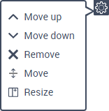
Click  on a container to show the following menu:

| Option | Description |
|---|---|
| Move up | Click to move the container above the container that’s immediately above it. |
| Move down | Click to move the container below the container that’s immediately beneath it. |
| Remove | Click to delete the container and all of its controls. |
| Move | Click to move the container to another tab. Only shows when tabbing is enabled. |
| Resize | Click to resize the container (for example, to change it from a 50%–50% container to a 100% container). |
5. Control Menu
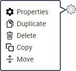
Click  on a control to show the following menu:

| Option | Description |
|---|---|
| Properties | Click to edit the control’s properties. |
| Duplicate | Click to duplicate the control (in other words, to add a copy of the control to the end of the container column). |
| Delete | Click to delete the control. |
| Copy | Click to copy the control (in other words, to add a copy of the control to the end of another data entry element). You must have the other data entry element open in another view. |
| Move | Click to move the control to the end of another data entry element. This deletes it from the current data entry element. You must have the other data entry element open in another view. |
6. Symbols/Icons
The following symbols/icons show on controls.
| Icon | Description |
|---|---|
| * | The control is required. Agents will not be able to save and close the interaction record unless they complete this control. To change this, edit the control’s Required? optional property. |
|
|
The control is read-only. Agents will not be able to change the value of this control. To change this, edit the control’s Read-only? optional property. |
|
|
The control is invisible. Agents will not see this control. To change this, edit the control’s Invisible? optional property. |

